Grid System & Breakpoint Responsive
Supported Versions
The details shared here apply to the most recent versions of our themes. Please keep your theme up to date for the best customization outcome.
- Handy version 4.0
- Xstore version 1.0
- Zeexo version 1.0
- Bookshop version 2.0
Our Grid & Responsive follows the Bootstrap 4.0 framework.
Grid System
Bootstrap 4.0 uses powerful mobile-first flexbox grid to build layouts of all shapes and sizes thanks to a twelve column system, five default responsive tiers, Sass variables and mixins, and dozens of predefined classes. Their grid system uses a series of containers, rows, and columns to layout and align content. It’s built with flexbox and is fully responsive. Please see more details here.
Breakpoint
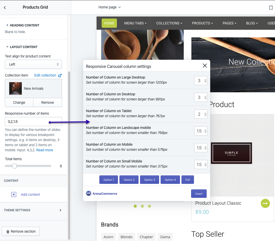
Currently, We gives you 4 breakpoint views to preview and style your website for different device sizes.
Each view is used to style elements for a particular viewport range:
- Large Desktop (Screens larger than 1200px pixels includes larger screens, such as desktop displays and laptops)
- Desktop (screens larger than 991px pixels includes larger screens, such as desktop displays and laptops)
- Tablet - Landscape (screens larger than 767px)
- Landscape - Portrait (screens smaller than 768px)
- Large Mobile (screens smaller than 576 px)
- Small Mobile (screens smaller than 375px)
Setting Responsive Columns with Carousel
Base on Breakpoint, we use responsive controls for managing how many columns (or items) display per row on the Shopify Theme. Responsive option can be used for setting breakpoints and additional options within.
You can view live demonstration of how to configure these settings in the video below: