Chromium Theme Settings
This chapter refers to the following section of the theme admin panel:
Online Stores > Themes > Chromium 2.0 > Customize > Theme Settings
1. Apps Intergration
Step 2: Configure Apps & Theme SettingOnline Stores>Themes>Chromium 2.0>Customize > Theme Settings > Apps Intergration`
WISHLIST & COMPARE
Read more: Install Arena Wishlist Compare app
LANGUAGES
 Detailed pricing:


 In order to get the Visual Editor working properly, please make sure to add the correct website URL in the settings.
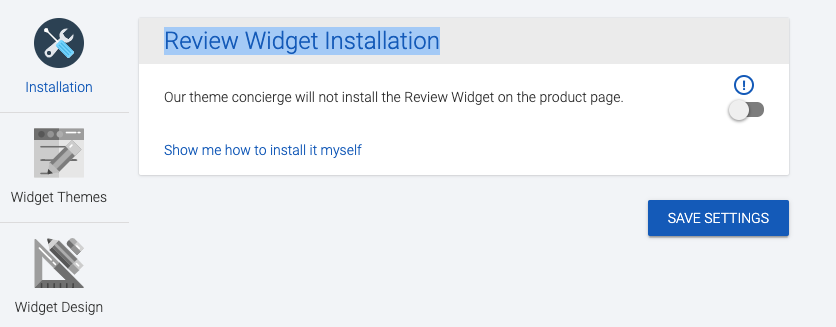
PRODUCT REVIEW
SEARCH BOX
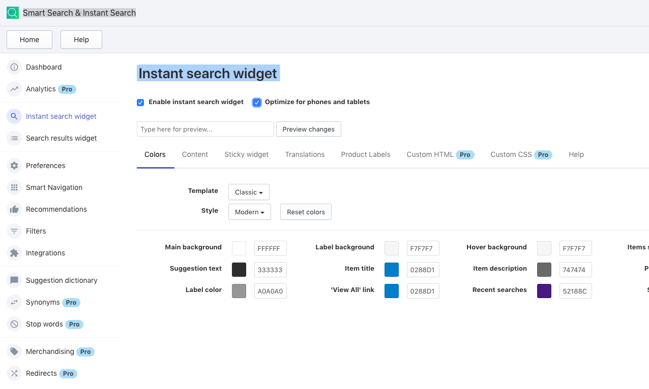
Chromium support Instant search widget. When you install the Smart Search app, you should disable theme default Ajax Search
2. Multi Currency
Online Stores > Themes > Chromium 2.0 Themes > Customize > Theme Settings > Multi Currency
| Group Parameter | Description |
|---|---|
| Enable Multi-currency | Enable multi currency switcher |
| Auto Currency Switcher On Customer Location | Use Geo IP Location to detect your customer location and auto select the store currency |
| Show Currency Flags | Show currency flag in header |
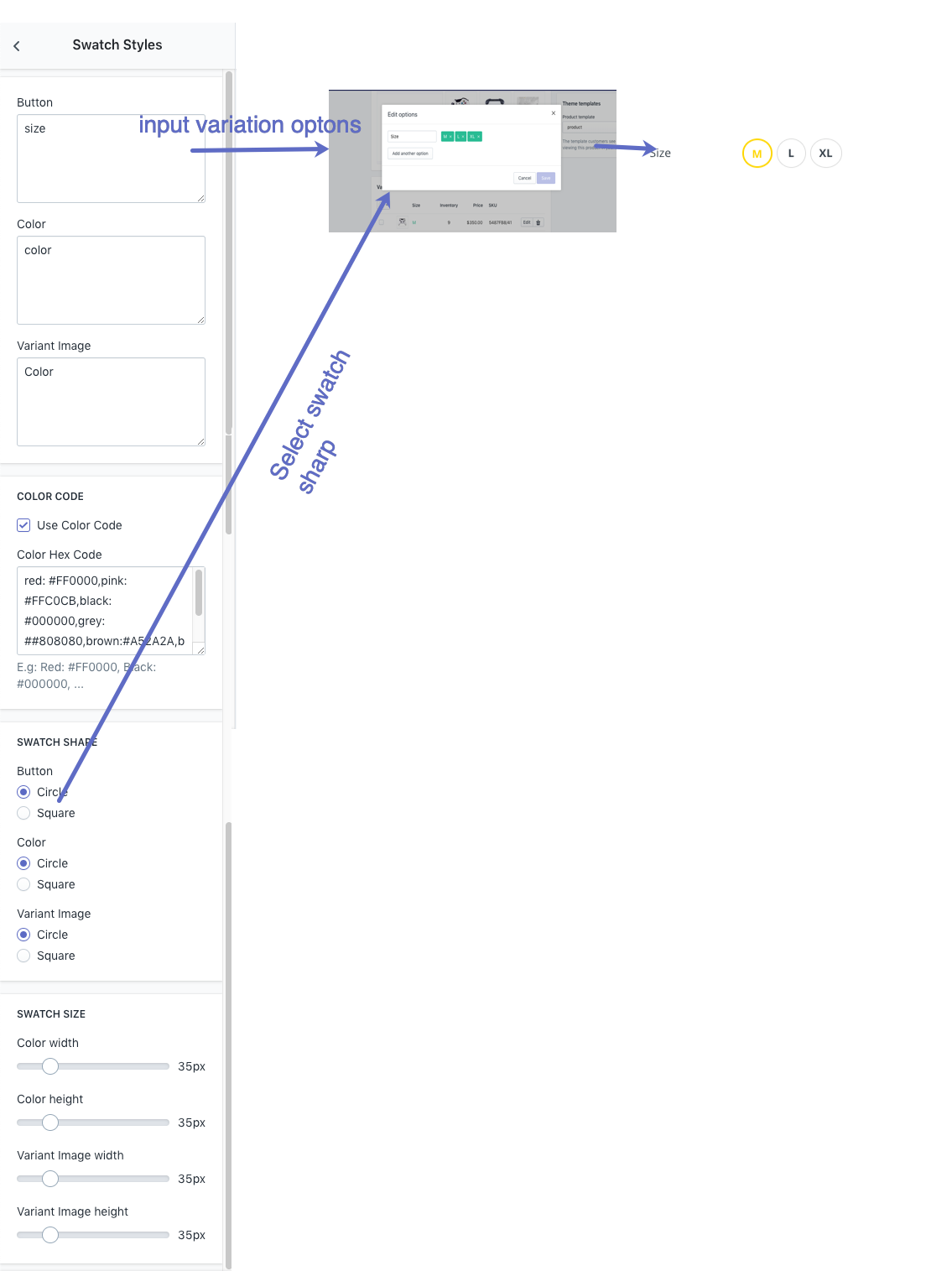
| Flag type | Retangle/ Square/ Circle: Show country-currency flag & select sharp |
| Money Format | Select money format |
| Currencies You Wish To Support | Separate your currency codes with a space. Use the ISO 4217 3-letter currency code. |
| Default Currency | Your store default curency |
3. General Settings
Online Stores > Themes > Chromium 2.0 Themes > Customize > Theme Settings > General Settings
| Parameter | Description | |
|---|---|---|
| Enable lazy loading images | Lazy loading is technique that defers loading of non-critical resources at page load time. Instead, these non-critical resources are loaded at the moment of need. Where images are concerned, “non-critical” is often synonymous with “off-screen”. | |
| Loading style | Default pre-loading style when enable lazyload | |
| Shop Disable Ajax Cart | Disable auto update total cart price when it is changed. | |
| Enable Catalog Mode | Disable Add to cart button | |
| Enable Search Function | Hide Search bar in Header | |
| Quick View Product: Disable Quickview button in product cards. | ||
| Button Back To Top | Enable button back to top in Desktop | |
| Homepage | Enable Left Column Section | Setting to enable/disable Left Column sections for homepage |
| Boxed Left Column Section | Display left column section in Container box layout (boxed layout) | |
| Enable Bottom Section | Show botton Static Section | |
4. Typography
| Parameter | Description |
|---|---|
| HEADER FONT | Configure Heading font family |
| Heading 1-6 Size | Configure Font Size Heading H1-H6 & font weight |
| BODY FONT | Configure Body font family |
| Body size | Configure body font size |
| Top Bar font size | Configure Top Bar (Announcement Bar) font size |
| Product item title size | Configure font size Product name in product page |
| Product item price size | Configure font size Product price in product page |
| Product title size | Configure font size Product name in Product card |
| Navigation size | Configure Navigation font size |
| Navigation dropdown size | Configure Navigation dropdown font size |
5. Icon
Online Stores > Themes > Chromium 2.0 Themes > Customize > Theme Settings > Icon
The icons setting use in whole store pages. You can checkout all font class here:
5. Colors & Style
| Parameter | Description | |
|---|---|---|
| LAYOUT | Layout Mode | Configure Wide / Boxed (Container) Layout |
| BACKGROUND BODY | You may select background image or color for body content | |
| BREADCRUMB | Configure breadcrumb detail: background color/images, height | |
| SETTINGS COLOR | Use Color Code | Enable to define your color name with Hex code |
| Color Hex Code | Add color code with format “colorname:hexcode”, separate with comma. | |
| E.g. red: #FF0000,pink: #FFC0CB | ||
| HEADER COLOR | Top bar background color | Background color for header top |
| Background color | Background color for header | |
| Background for the number on icons | Phone icon in header & others | |
| Shop Department background color | Background for Header department button | |
| Custom Text color | Color for header text | |
| Body color | Main Color | Primary color use for main site |
| Body Background | Color body background | |
| Miscellaneous Color | Text for misc detail | |
| General Text Color | Text color in dark site | |
| General Light Text Color | Text color in light site | |
| Title Text Color | General title color | |
| Link Color | General Text Links color | |
| Border Color | General boder color | |
| Ratting Empty Color | Star rating empty color | |
| Navigation Color | Link color | Nav Text links color |
| Menu item hover color | Color item slide when hover. | |
| Menu item hover background color | Nav background when hover color | |
| Background Color In Dropdown | Background color for dropdown nav | |
| Navigation background color | Navigation backgroud color | |
| Link Item Color In Dropdown | color item in dropdown menu | |
| Link Item Hover Color In Dropdown | color link item in dropdown menu | |
| Vertical Menu Color | similar above | |
| Navigation Label Color | Text sale label color | Text color in Sale label |
| Sale label background | Background color Sale label | |
| Text new label color | Text color in `New Label`` | |
| New label background | Background color New label | |
| Hot label color | Text color in `Hot Label`` | |
| Hot label background | Background color Hot label | |
 | ||
| Footer Color | Footer Content Background | Background color |
| Footer Text Color | Footer text color | |
| Footer Link Color | Footer text links color | |
| Footer Link Hover Color | Footer text links hover color | |
| Footer Copyright Background | Footer bottom copyright container background | |
| Footer Copyright Color | Copyright text color | |
| Button style 01 | Custom button style 01: background, text, border, hover… | |
| Button style 02 | Custom button style 02: background, text, border, hover… | |
6. Fomo Popups
TIP
Fomo Popups display real-time customer activity notifications on your store. You can use it as a Social Proof Markteting Tool to Boost Conversions.
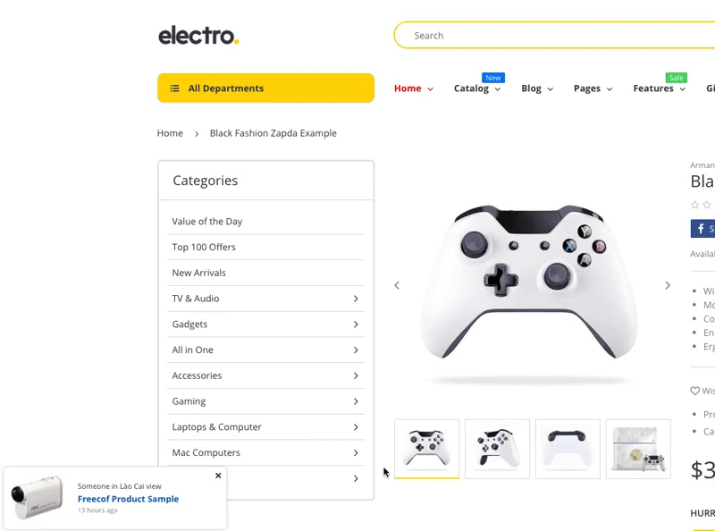
Sale Notification Popups
Popups to show the number of Sale on your Online Store to encourage customer making purchase.
Sale Notification Popup
Sale popup template:
Some one in {Random City} {Random Text}.
{Random Product in Collection}.
{Random Number} {Random Text}
| Parameter | Description | |
|---|---|---|
| Popup Position | Popup position to display on Desktop when lauch. Position: Bottom Left/Bottom Right/Top Right/Top Left. | |
| Visibility | Show On Home Page | Show Sales Notification on Home Page |
| Show On Product Page | Show Sales Notification on Product Page | |
| Show On Collection Page | Show Sales Notification on Collection Page | |
| Hide on Mobile Device | Hide Sales Notification on Mobile Device | |
| {Random City} | Random City base on | GEOIP: Auto Dectect Visitor Country and get list all cities to use Manual Cities List: Input optional Cities in next field Combine both list: Mixup cities list in visitor country & manual cities list. |
| Manual Cities List | Your manual cities list. Separate city by ; | |
| {Random Text} | Random Text | Random text. eg: just bought;view;search |
| {Random Product in Collection} | Random Product in Collection | Select product in Collection to show |
| {Random Number} | Random Number | Select random number to show. Separate number by ; |
| {Random Text} | Random Text | Random text. eg: minutes ago;hours ago;days ago |
| Background color | Background color | |
Visitor Count Popups
Popup to show Random Visitor detail to Product page.
 Visitor Count Template:
{Random Number} of visitor {Text Field}
| Parameter | Description |
|---|---|
| Show Visitor Count Popup | Show Visitor Count Popup when Customer visit Product page |
| Remove cookie every | Time gap to Reset the number of visitors show in the product. |
| Counter Min | Minimum visitor number to show |
| Counter Max | Maxium visitor number to show |
| Value range of counter after reload page (Percent x The previous value) | Standard deviation range when visitor refresh product page in Web Browser. |
| Popup position | Popup position display in Desktop |
| Icon User | Icon image User icon |
| Text Field | text show at {Text Field} |
| Background color | Visitor Count Popup background color |
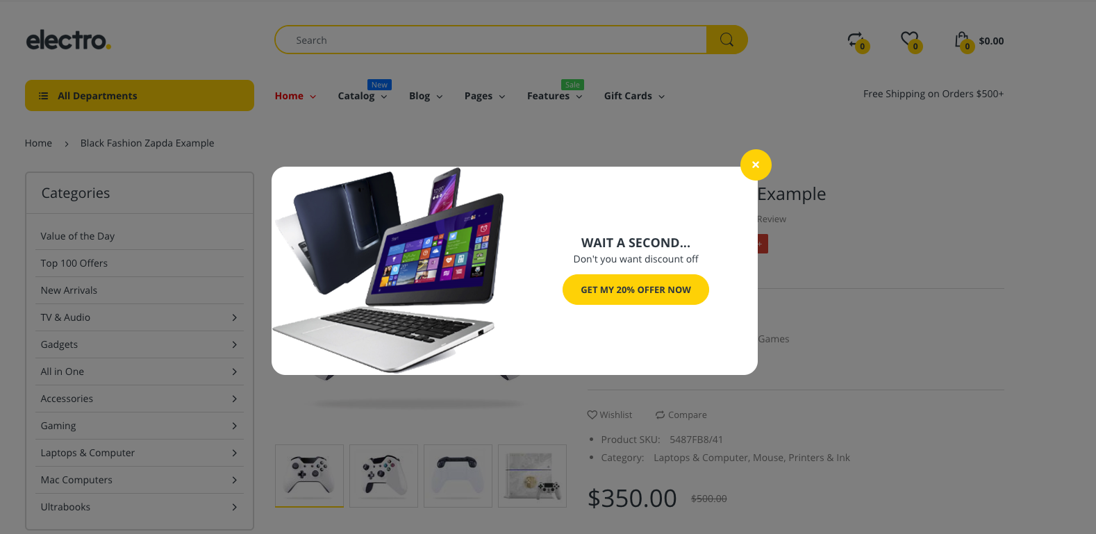
Discount Popup
Configure to Product Popup Coupon. Intent Exit Popup when customer hover out of Product page.