Zeexo Guide: Common Settings
1. Layout Boxed & Wide & Wide Padding
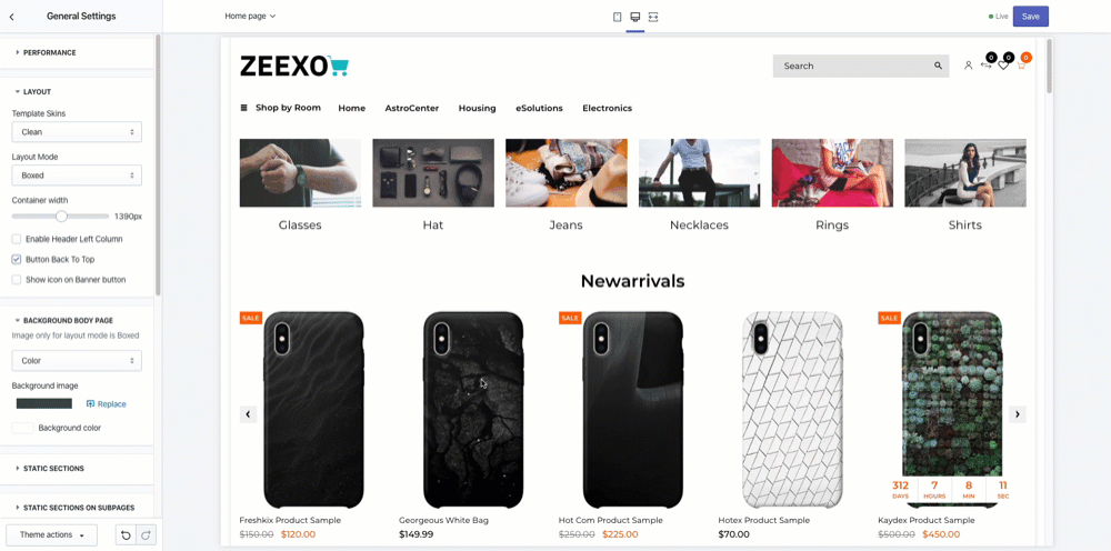
Global Box & Wide Setting
You can configure wide or boxed layout variants. Wide layout is perfect for you, if you like airy websites, with no visible borders or page edges.
Boxed layout comes with different ready-to-use background patterns & images, or you can define any color you would like to use by simply picking it with Colorpicker.
Wide: Full-width
This expansive layout gives the impression that the website has no boundaries. Taking up the whole space from left to right of the screen, with the content extending to each side gives Shopify web developer greater flexibility, allowing content to be placed anywhere on the web page, using padding to ensure visibility on different devices.
As the layout is based on percentage in relation to the current browser size, full-width layouts adapt accordingly with the same resolution across devices. In fact, the user only sees what the designer sees if they have devices in common.
Advantages of Wide
- Creates a clean, contemporary feel
- Compatible across different browser sizes
- Perfect was to display your images
- Minimises scrolling to access content
- It creates a bold aesthetic effect, illustrating creativity
- Disadvantages of full-width
- The designer needs to anticipate potential issues on different devices
- Images and videos will need to be modified according to device so that they resolve correctly on the different screen size
Boxed Layout
Boxed layouts have a set margin around the entire page. Also known as a fixed layout, because the body of the page has a container with a fixed width and prescribed set of boundaries.
Your content (images and copy) will be housed in the container, while the surrounding space, outside the boundaries can be used to add background with designs of images. While the boxed content of the container remains the same regardless of the device, the content outside the border may not be visible on smaller devices, so make sure that this content enhances but is not vital to the web design and website objectives.
As this layout remains fixed regardless of screen, the user will see the same design that the designer sees. This structure creates a traditional, classic look which can be used for formal business environments.
Advantages of Boxed Layout
- The boxed design provides a structured, clean look. If you’re wanting a consistent look across all devices, then the boxed option would work for your brand.
- The style lends itself to the use of structure to draw the visitor’s attention to content and calls to action. Disadvantages of boxed design
- Larger screens can have a lot of white space, while other elements may be concentrated in the centre of - the web page.
- Changes to font size can impact on the layout, especially for larger increases in size.
Section Box & Wide
TIP
It’s only work when you select Theme Layout Settings is: Wide / Wide with Padding
2. Hide section on mobile
The ability to hide certain sections on desktop or mobile is made simple with the theme. The ability to hide certain sections on desktop or mobile is made simple with the Zeexo theme’s built-in under Layout options
Eg.Settings
Sections Customize > Sections > ‘Sections name’ > Visibility: Hide for Mobile 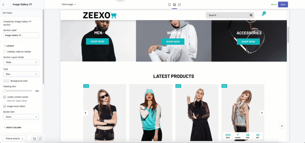
3. Spacing Settings
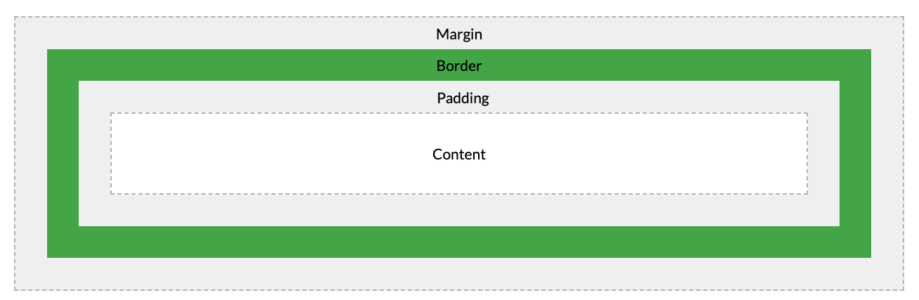
All HTML elements can be considered as boxes. In CSS, the term “box model” is used when talking about design and layout. It consists of: margins, borders, padding, and the actual content. The image below illustrates the box model:
- Content - The content of the box, where text and images appear
- Padding - Clears an area around the content. The padding is transparent
- Border - A border that goes around the padding and content
- Margin - Clears an area outside the border. The margin is transparent
In Shopify Theme Editor, some way we could build spacing base on padding, margin. There are some kind of options:
Margin/Padding Slider
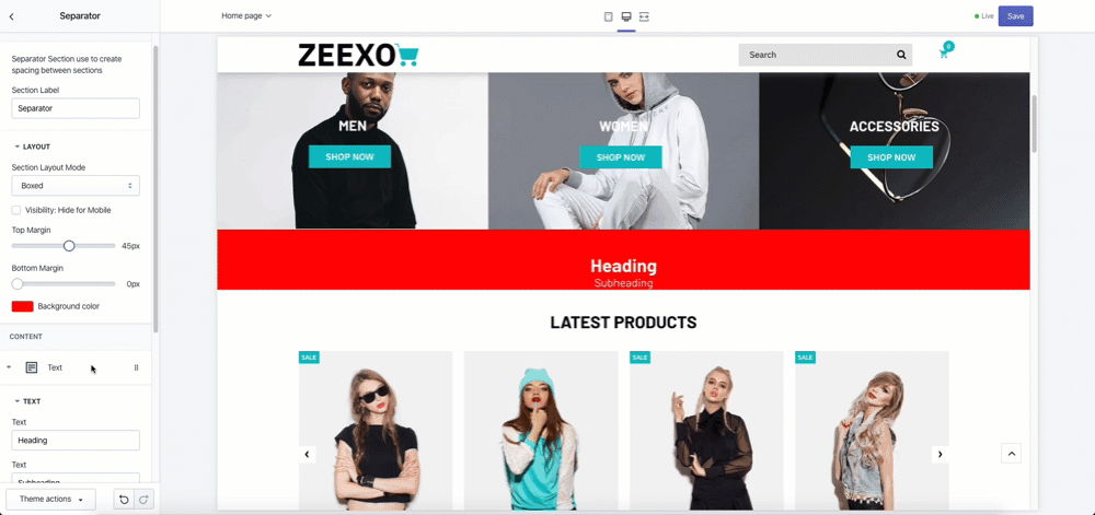
Margin/Padding Field
4. Grid & Responsive
5. Carousel Block / Row Block
Carousel Block: The carousel is a slideshow for cycling through a series of content, built with CSS 3D transforms and a bit of JavaScript. It works with a series of images, text, or custom markup. It also includes support for previous/next (navigator) controls and indicators (bullet point).
Row Block: is a series of content without any Javascript effect and animation.