XStore Collection Page Configuration
How to Create Collection Page
In the following video, we will guide you to create a new collection based on 2 methods: manually and automatically.
The difference between the two is not just creation speed, but also the conditions in which the product is assigned. You can learn more about conditions for products here.
You will also see mentioned in the video collection template. For this, you can follow the links below to see how each style will turns out.
collectioncollection.collection-full-widthcollection.collection-rightcollection.infinitecollection.order-formcollection.order-form-v2
These templates will be introduced briefly again in the video below.
How To Clone Collection Template
From the 2:21 mark, the video will show you how to make a template of your own from 1 of XStore built-in templates.
How to customize Collection Page
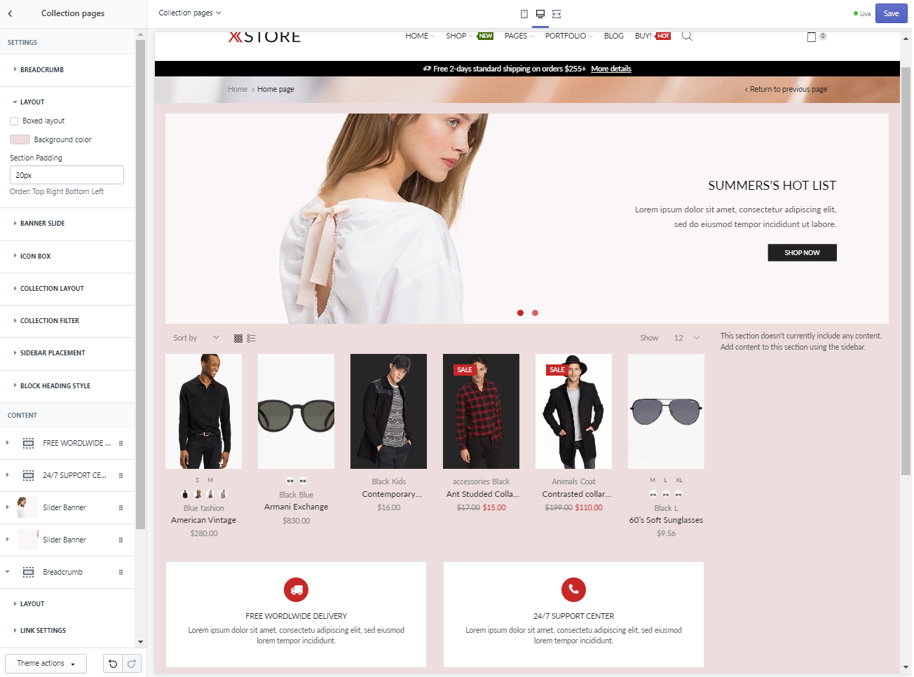
To begin customizing Collection Page(s), we will need to choose ‘Collection page’ from the Theme Editor’s top dropdown menu and choose ‘Collection pages’ in the Sections tab.
We offer many choices to customize the Collection page in our built-in toolkit as seen below, including Page Layout (seen as ‘LAYOUT’), Collection Layout (under the same name) and more importantly, Collection Filter.

As you can see within this Collection Page, there are only the BreadCrumb, Slide Banner and the 2 Icon Boxes at the bottom apart from the Product Cards, Grid/List view  and
and Sort function. Since this Collection template has Sidebar section coded to the right, the voided section message appears in its place instead.
In this tutorial, we will guide you to customize, add and configure the elements available in XStore Collection templates.
BreadCrumb
BreadCrumb is the bar that seperates the Header and Slide Banner that is available on every page. You can choose whether or not the bar is shown depends on your aesthetic choices.
Customizing this bar can be done in 2 ways.
- Choosing an image for the BreadCrumb background below 
- or use the same BreadCrumb’s background as the other pages by upload an image to Theme settings > Breadcrumb, then come back to Collection Page and choose
Inherit Background image.
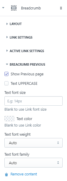
You can tweak the BreadCrumb layout further by adding the BreadCrumb layout into the page.
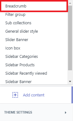
| LAYOUT | LINK SETTINGS | ACTIVE LINK SETTINGS | BREADCRUMB PREVIOUS |
 | 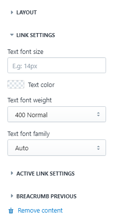 | 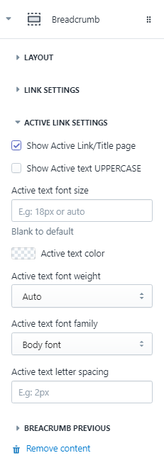 |  |
Layout
This settings will dictate the layout of the whole Collection Page.
You can choose ‘[x] Boxed layout’ to put the whole page’s layout into an invisible box or uncheck to let the contents fill in the full width of the browser.
If you want to customize the Boxed Layout, simply uncheck the ‘[x] Boxed layout’ choice and fill in the Section padding measurement in px according to the order listed in the picture below. This will confine the page layout into a fixed measurement of your choice.
