Xstore Customization Basics & Common Terms
Finally, it’s time to start customizing to breath your business’s essence into the store!
Whether Shopify is your main retail portal or just an extension of your brick-and-mortar business, your online site should always accurately convey the heart and soul of your brand.
In this chapter, we will begin to go through the nuts and bolts of customizing your Shopify store, mainly through the glossaries of the terms, where you can easily find them and how to work with them to better tune your store to your business.
Before you blaze ahead and start customizing your theme, it’s a good idea to duplicate your theme to create a backup copy. This makes it easy to discard your changes and start again if you need to. Our friend at Rewind also offer backup service for your theme in the long run. You can see more details here.
- To begin, go to your myShopify Admin Homepage, click
Online Store>Theme. - A new window will open with all the themes you have installed listed. In the
Current Themesection is the myShopify default ‘Debut’ theme, or the theme you have Published. - If you have not published the XStore theme by now, please do so. This tutorial is exclusively for the XStore theme only. The publishing process has been discussed in Step 5 of the installation process, which you can visit again here.
- Once you have got XStore published, click
Customize.
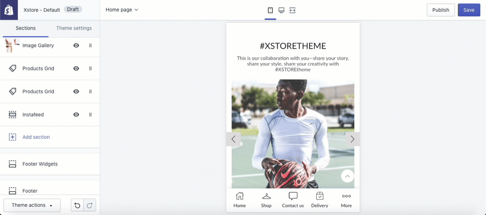
1. Sections and Theme Settings
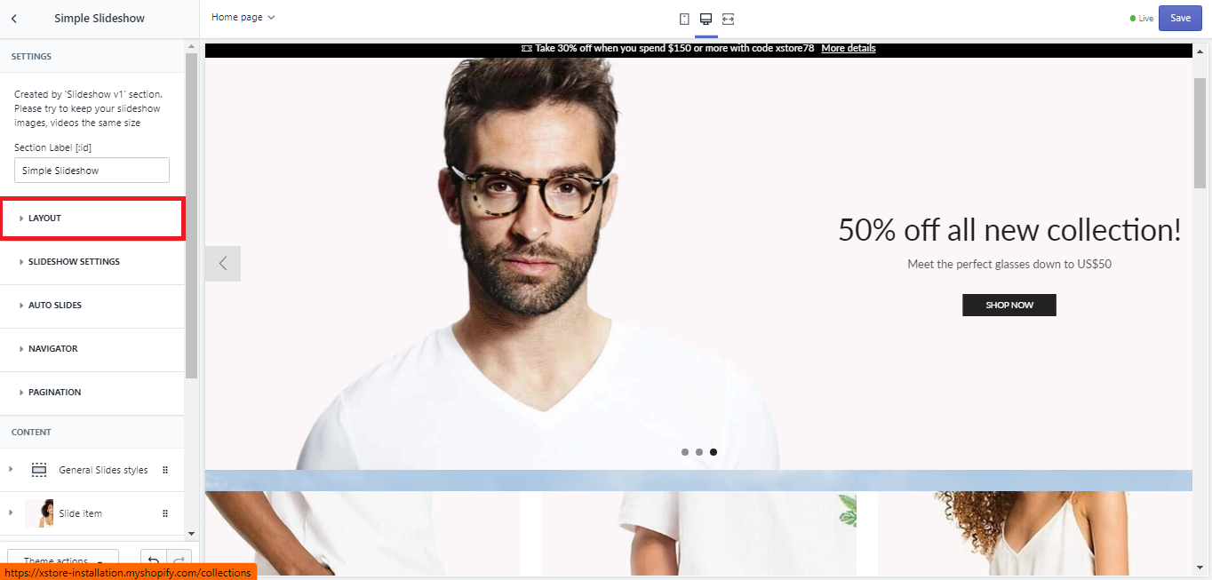
Upon reaching the Theme Editor window, you will see the demo site live on the right and the modification column on the left. At the head of the modification column are 2 tabs: ‘Sections’ and ‘Theme settings’.

Although you may find many similar options between the two, the first tab ‘Sections’ focus on modifying each section of the page, including the ‘Announcement Bar’, ‘Header’, ‘Text Slider’,etc… while the ‘Theme settings’ focus on modifying the page as a whole.
This is also the basic navigation of the customization process, and knowing what you want to configure will help you save time on finding the right passage.
Different types of pages have different Sections. When you first open the Theme Editor, the settings for the Home page are shown. To access the settings for other pages, select the page type from the top bar drop-down menu:

2. Layout: Boxed & Wide & Wide Padding
To reach the Layout settings, in the Theme Editor window, choose Theme settings > General settings > Layout.
Wide layout is a layout setting that would expand all your store contents to the edge of the window. This is perfect if you envision your store with an airy, comforting vibe, as it takes up the whole space from left to right of the screen. There is no visible borders or page edges for this selection. You will need to use padding to ensure visibility on different devices.
As the layout is based on percentage in relation to the current browser size, full-width layouts adapt accordingly with the same resolution across devices. In fact, the user only sees what the designer sees if they have devices in common.
| Advantages | Disadvantages |
|---|---|
| Creates an airy, comforting vibe. | The designer needs to anticipate potential issues on different devices. |
| Compatible across different browser sizes. | Images and videos will need to be modified according to devices so they can fit correctly on the different screen size. |
| Perfect to showcase your key products. |
Boxed layout, on the otherhand, will leave two visible empty space on both the left and right of your website as it sets a margin around the entire page. Also known as a fixed layout, the body of the page has a container with a fixed width and prescribed set of boundaries. This one is perfect if you want your site to be compatible with a multitude of devices, as well as giving your store an urban, contemporary vibe.
Please note, while the boxed content of the container remains the same regardless of devices, the content outside the border may not be visible on smaller devices, so you need to make sure this side content is not a vital part in the site objective.
Your content (images and copy) will be housed in a container, while the surrounding space, outside the boundaries can be used to add background with designs of images. You can also use these empty spaces to add on more banners, or simply to ease customer’s eyes if you happen to have an online chatbox installed. This option comes with different ready-to-use background patterns & images while you can also define any color you want by simply picking it with the Colorpicker.
As this layout remains fixed regardless of screen, the user will see the same design that the designer sees. This structure creates a traditional, classic look which can be used for formal business environments.
| Advantages | Disadvantages |
|---|---|
| Provides a structured, clean look. | May look disproportionate on larger screens. |
| Consistent across all devices. | Changes to font size can have impacts on the layout. |
| Contemporary, stylish feel that increases sales conversion. |
- To switch between the Boxed and Wide layout, simply uncheck the
Boxed layoutoption. - To know whether you are selecting a Wide layout or Wide with Padding layout, take a closer look at the Layout settings bar. Normally, our demo theme will set a
Container padding/ Column paddingfigure for you. If you want to unpad the layout of your site, please set this figure to ‘0px’ as seen below.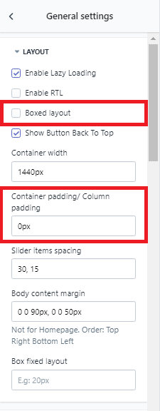
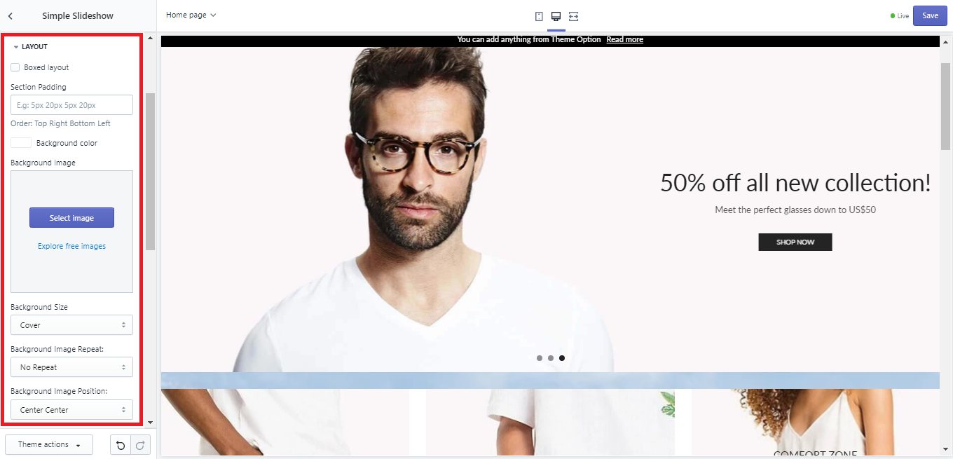
Section Individual Override
You can also modify each section to be boxed or wide individually. Please note, this only works when you select the ‘Wide’ or ‘Wide with Padding’ lay out.
To do so, upon reaching the Theme Editor window, choose Settings > 'Section name' > Layout. You can see the same layout options available, although this time your modifications will only apply for the chosen section.
3. Hide section on mobile
Some sections have the ability to hide certain sections on desktop or mobile. This is made simple with the XStore theme’s built-in option in those specific sections under their Layout option tab. To enable this, go to
Sections > 'Section name' > Check the option Hide on Mobile 
4. Section Spacing Settings
Spacing is very important for creative designs. It helps create the golden ratios to boost aesthetic, thus increase an online store’s sales conversion rate. Xstore allows you to set the exact spacing you need with any valid css unit like px or %.
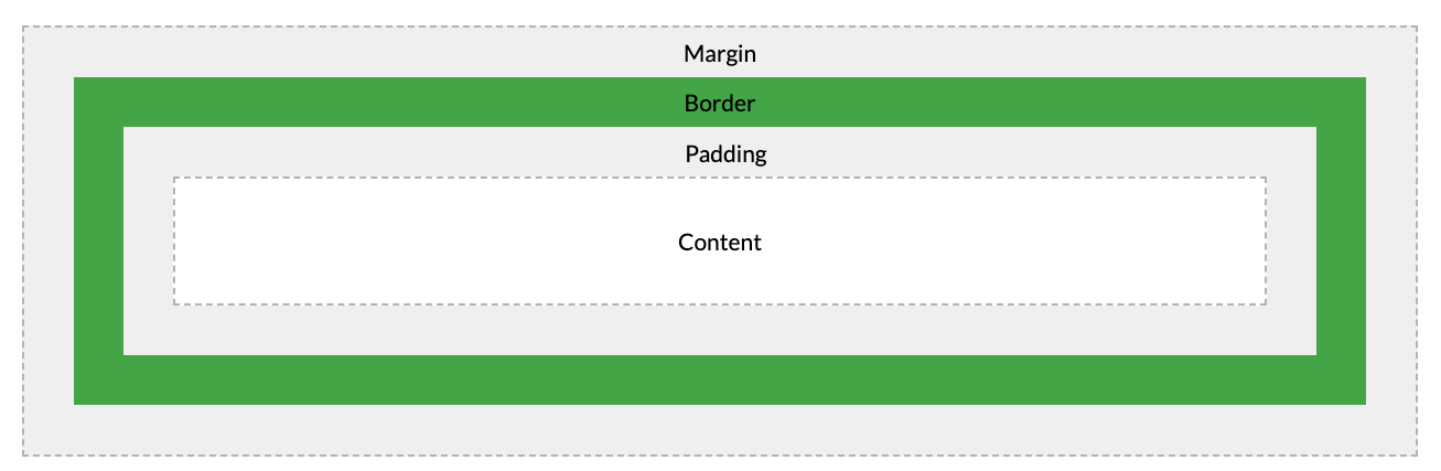
To help you better understand how spacing work in a website, I will go through HTML elements a little. In short, all HTML elements can be considered as boxes. In CSS, the term “box model” is used when talking about design and layout. It consists of: margins, borders, padding, and the actual content. The image below illustrates the box model:
- Content - The content of the box, where text and images appear (product cards, banners, carousels, etc…).
- Padding - Clears an area around the content. The padding is transparent.
- Border - A border that goes around the padding and content. This is the frame of the content area, which may becomes visible with ‘Boxed Layout’ settings.
- Margin - Clears an area outside the border. The margin is transparent.
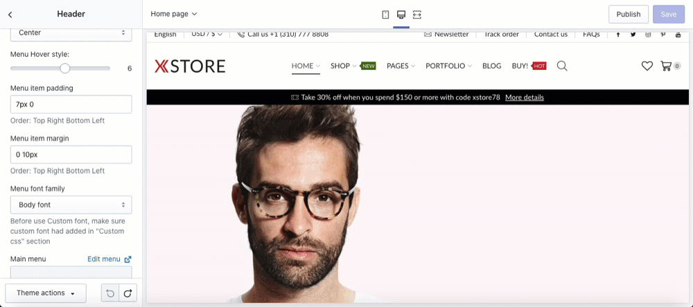
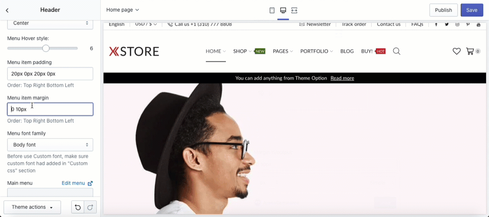
In the Theme Editor, we can modify the width of the padding and margin. To do so, you only need to go to the section you want to modify and change the px figure under ‘Menu item padding’ and ‘Menu item margin’. Details are shown in the gif below:
Padding
Margin
Section Separator
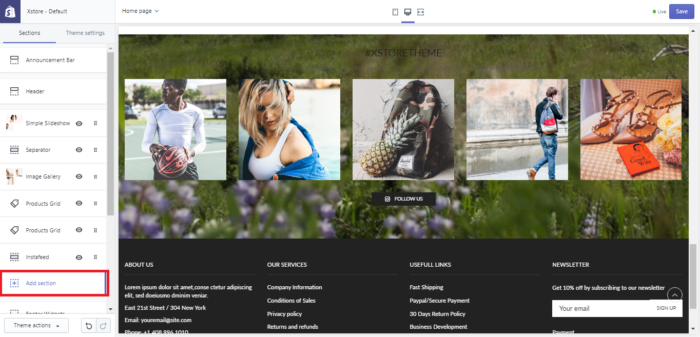
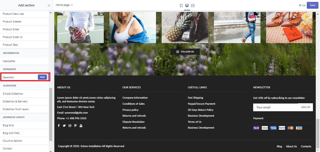
You can also separate Sections with responsive spacing by adding ‘Seperator’ between them. To do so,
- Scroll to the bottom of the ‘Sections’ tab to find the
'Add section'option. - In the
'Add section'menu, find theSeperatortab. - Click on the tab and click
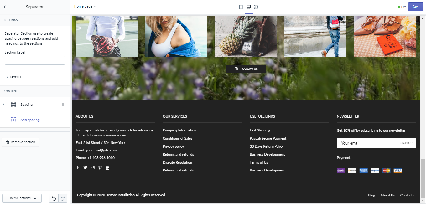
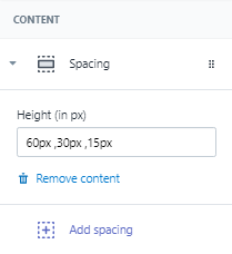
Add. - Once the new Seperator was made, you can modify its height across 3 main devices: desktop, tablet and mobile.
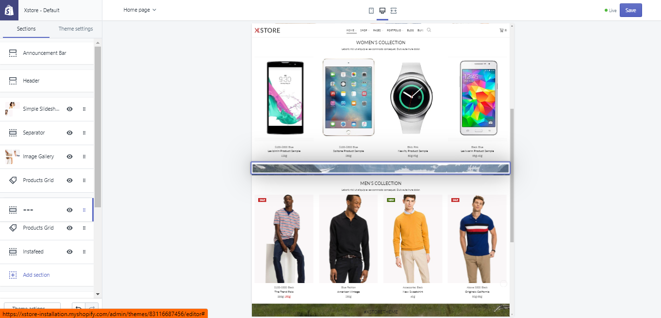
- To seperate desired sections, simply move the Seperator to the place between them in the Section column.
You can expand this line to view the steps in pictures, or view the gif below.
5. Grid System & Breakpoint Responsive
Our Grid & Responsive follows the Bootstrap 4.0 framework. Please see more details here and here.
You will need to keep this information in mind when configuring number of items per row and responsive options.
6. Carousel Block / Row Block
Carousel Block:
- The carousel is a slideshow that cycling through a series of content, built with CSS 3D transforms and a bit of JavaScript. It works with a series of images, text, or custom markup. It also includes support for previous/next (navigator) controls and indicators (bullet point).
 Row Block: is a series of content without any effects and animation.
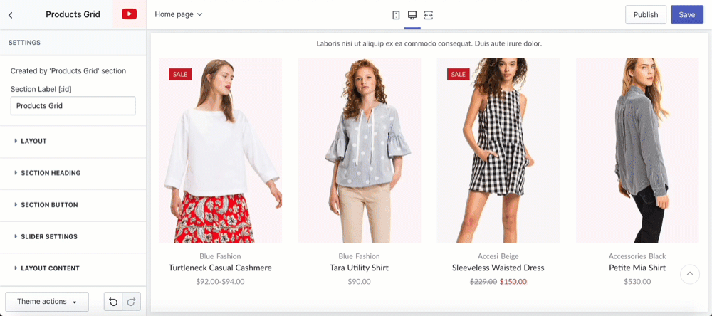
7. Number of items per row & responsive options
- As you can see in the Row Block definition above, there are 4 products in it. Since each Row Block is a Section within your site, the number of product each row will display can also be determined via each
Products Gridtab in theSectionstab. - To do so, you need to click the
Layout Contenttab inProduct Grid, then focus on theMax number of items per rowandTotal itemsunderCollection item. - The
Max number of items per rowmeans the maximum items visible without clicking the ‘Next’ or similar icon. Upon clicking on the number box, theResponive Carousel column settingsdialogue box will appear so you can change the number of items shown for Desktop - Tablet - Mobile. The same order still apply if you choose to type in the numbers yourself ignoring the dialogue box. You can customize further by choosing the options available in the dialogue box. Apart from integers, you also add numbers with decimals to let a product card ‘peek’ out from the Product Grid border.
In this tutorial, I choose theFulloption to show you all the 6 options you can configure.
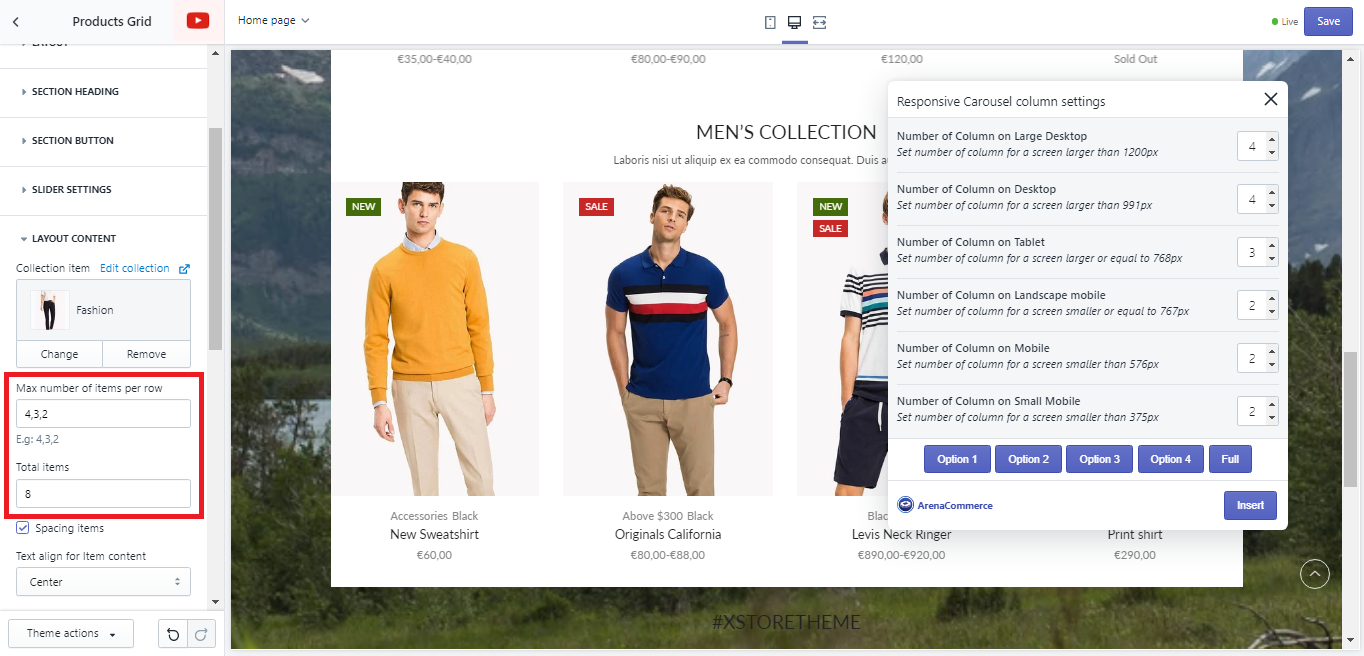
Total itemsis the maximum amount of products you want each to Grid contain. This number is usually all the products you want to highlight in that Collection so customer can browse when clicking the ‘Next’ or similar button.
Please see the gif below to see how these option config play out.
8. Mobile Bar Section
- To edit your Mobile Bar Section, first you will need to activate the Mobile Bar. In order to see it, in the Theme Editor, click on
Theme Settings>General Settings>Sections Global>[x] Enabled Mobile bar. - Now that you have activated mobile bar, you can switch to mobile view of your theme to see it at the bottom of the Demo.
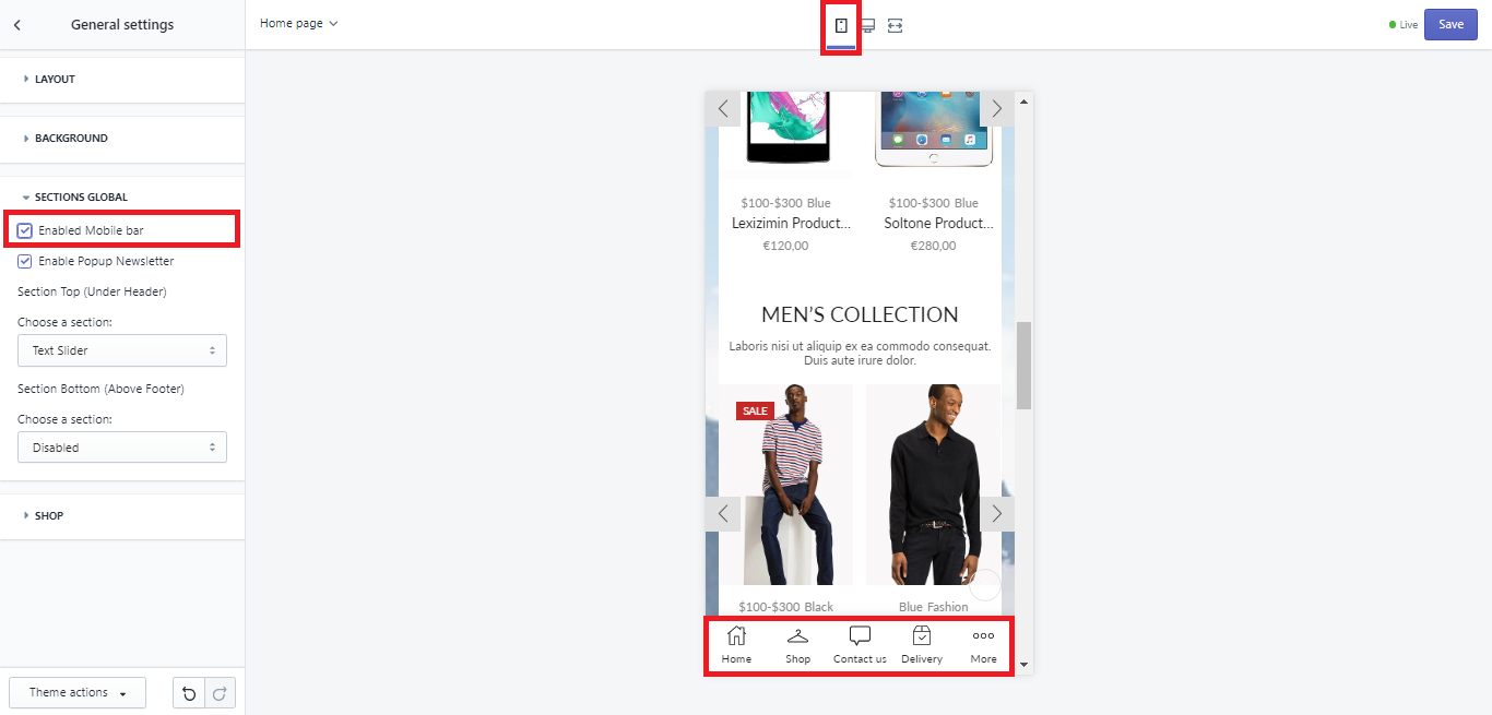
- You can customize the bar. To do so, now you need to switch to the
Sectionstab in the Theme Editor homepage > scroll down and findMobile bartab. - This tab allow you to:
- Change the background color of the bar.
- Configure the bar’s height and padding to optimize layout.
- Add and remove blocks (5 blocks maximum).
- Change the font size and color of the blocks.
- Change the icon of each block into another icon or images that you want.
Please see the video below for better details and visualization:
9. Product Cards
Product card is the template that contains each of your product on your homepage or any page within your store. Its job is only to show pictures, color swatches, size, prices, promotions, add-to-cart option and maybe tags or any other product identification available so customers can get a quick grasp of what that product offers. Each product card is linked with its respective product page. Each card is highlighted in green in the gif below.
To see how you can configure each product card, please click here How to configure Product Cards layout & options
Editing the theme code
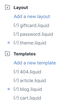
There will be times when you want to edit the code of your theme, especially when you stop using a third-party app. To open the code editor, please do the following:
- From your myShopify Admin Homepage, go to
Online Store>Themes. - Click
Actions>Edit code. The code editor shows a directory of theme files on the left, and a space to view and edit the files on the right:
When you click a file in the directory on the left, it opens in the code editor of that file. You can open and edit multiple files at once. Any files that you modify will show a purple dot next to the file name:
This can help you to keep track of where you have made changes.
If you want to revert any changes to a file after you click Save, then open the file and click Older versions. A drop-down menu shows the date and time for each save that you’ve made. Select the version that you want to revert to, and click Save.